Shopify
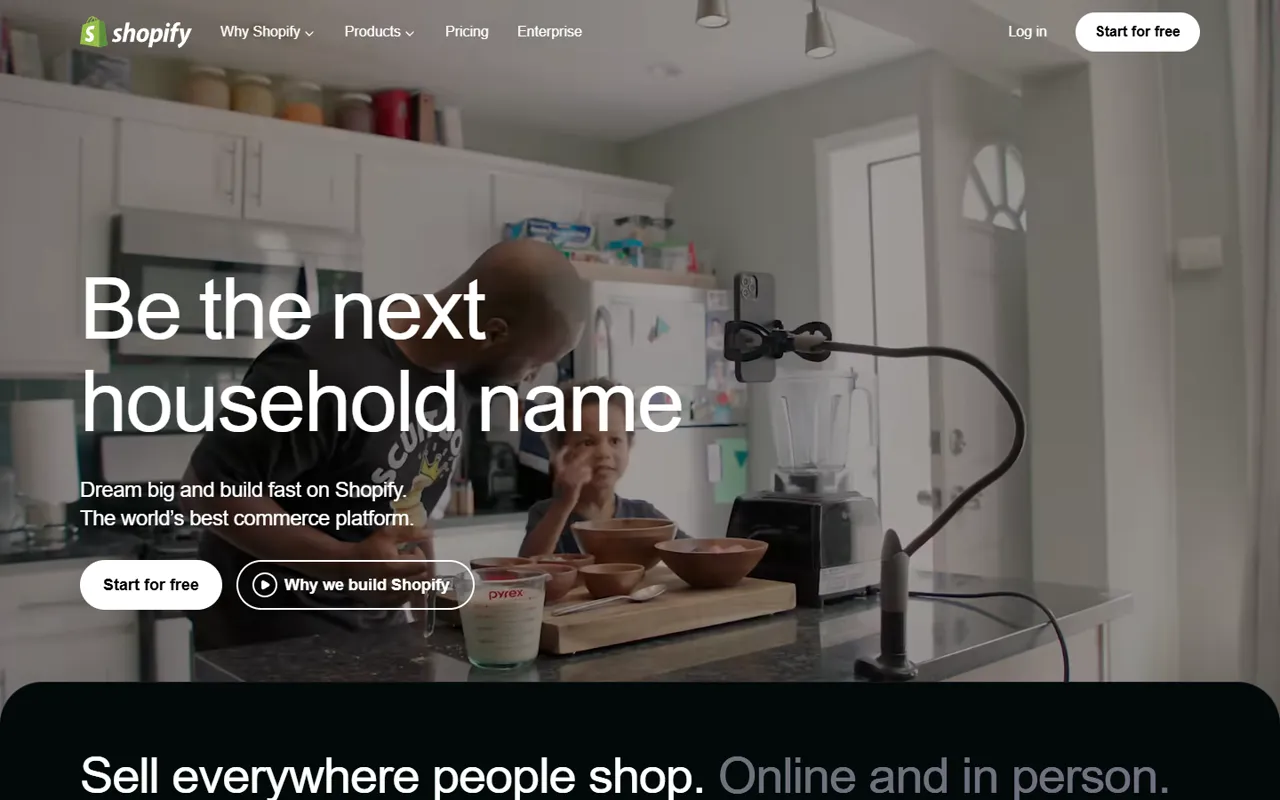
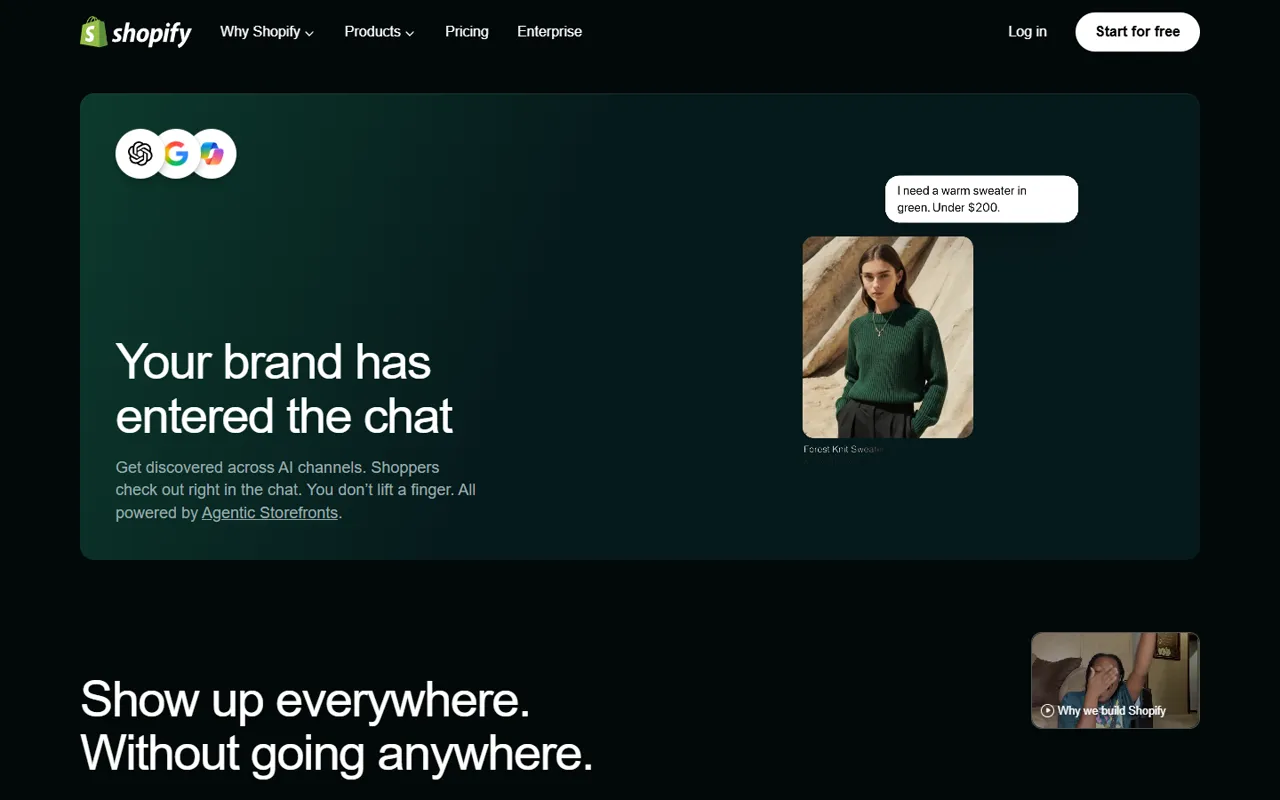
Shopify sets large Shopify-Inter headlines in a light weight with tight tracking on a dark void canvas. Void (#041e18) is reserved for actions, on fully rounded pill buttons, while the rest of the page stays with void text and neutral surfaces. The most common corner radius is 12px, with 3.35544e+07px and 4px on smaller elements.
shopify.com ↗Colors
Void
#041e18
Primary actions and links
Deep Void
#061a1c
Secondary accent and highlights
Void 2
#000000
Page canvas
Void 3
#000000
Headlines and body copy
Void 4
#02090a
Surface or divider
Bone White
#ffffff
Surface or divider
Void 5
#000a1e
Surface or divider
Silver Mist
#a1a1aa
Supporting colour
Void 6
#020a08
Surface or divider
Type scale
Buttons
Style reference measured from the public page at shopify.com on 2026-10-12 for design education. Shopify and its logos are trademarks of their owners; AnimatedWebs is not affiliated with or endorsed by them. Owners can ask us to update or remove this page via our copyright page.
# Shopify — Style Reference
> Shopify sets large Shopify-Inter headlines in a light weight with tight tracking on a dark void canvas. Void (#041e18) is reserved for actions, on fully rounded pill buttons, while the rest of the page stays with void text and neutral surfaces. The most common corner radius is 12px, with 3.35544e+07px and 4px on smaller elements.

**Theme:** dark · **Source:** https://www.shopify.com (captured 2026-10-12). Measurements come from the rendered page; roles are interpreted.

## Tokens — Colors

| Name | Value | Token | Role |
|------|-------|-------|------|
| Void | `#041e18` | `--color-accent` | Primary actions and links |
| Deep Void | `#061a1c` | `--color-secondary` | Secondary accent and highlights |
| Void 2 | `#000000` | `--color-canvas` | Page canvas |
| Void 3 | `#000000` | `--color-ink` | Headlines and body copy |
| Void 4 | `#02090a` | `--color-surface-1` | Surface or divider |
| Bone White | `#ffffff` | `--color-surface-2` | Surface or divider |
| Void 5 | `#000a1e` | `--color-surface-3` | Surface or divider |
| Silver Mist | `#a1a1aa` | `--color-surface-4` | Supporting colour |
| Void 6 | `#020a08` | `--color-surface-5` | Surface or divider |

## Typography

| Role | Family | Size | Weight | Line height | Tracking |
|------|--------|------|--------|-------------|----------|
| Heading | Shopify-Inter | 56px | 330 | 1.08 | -0.030em |
| Subheading | Shopify-Inter | 56px | 300 | 1.08 | -0.030em |
| Body | Shopify-Inter | 16px | 420 | 1.50 | 0 |
| Nav | Shopify-Inter | 14px | 420 | 1.43 | 0 |

Font families on the page: Shopify-Inter, ui-monospace. Brand fonts are licensed by their owners; use a close open alternative (Inter, Geist, Manrope) if you don't hold a licence.

## Shape

- Corner radius, most to least used: 12px, 3.35544e+07px, 4px, 8px, 9999px
- Primary button: background `#ffffff`, text `#000000`, radius 9999px, padding 8px 20px, 16px / 550