Spotify
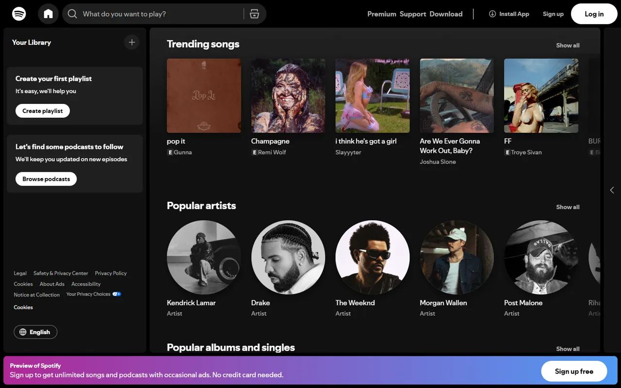
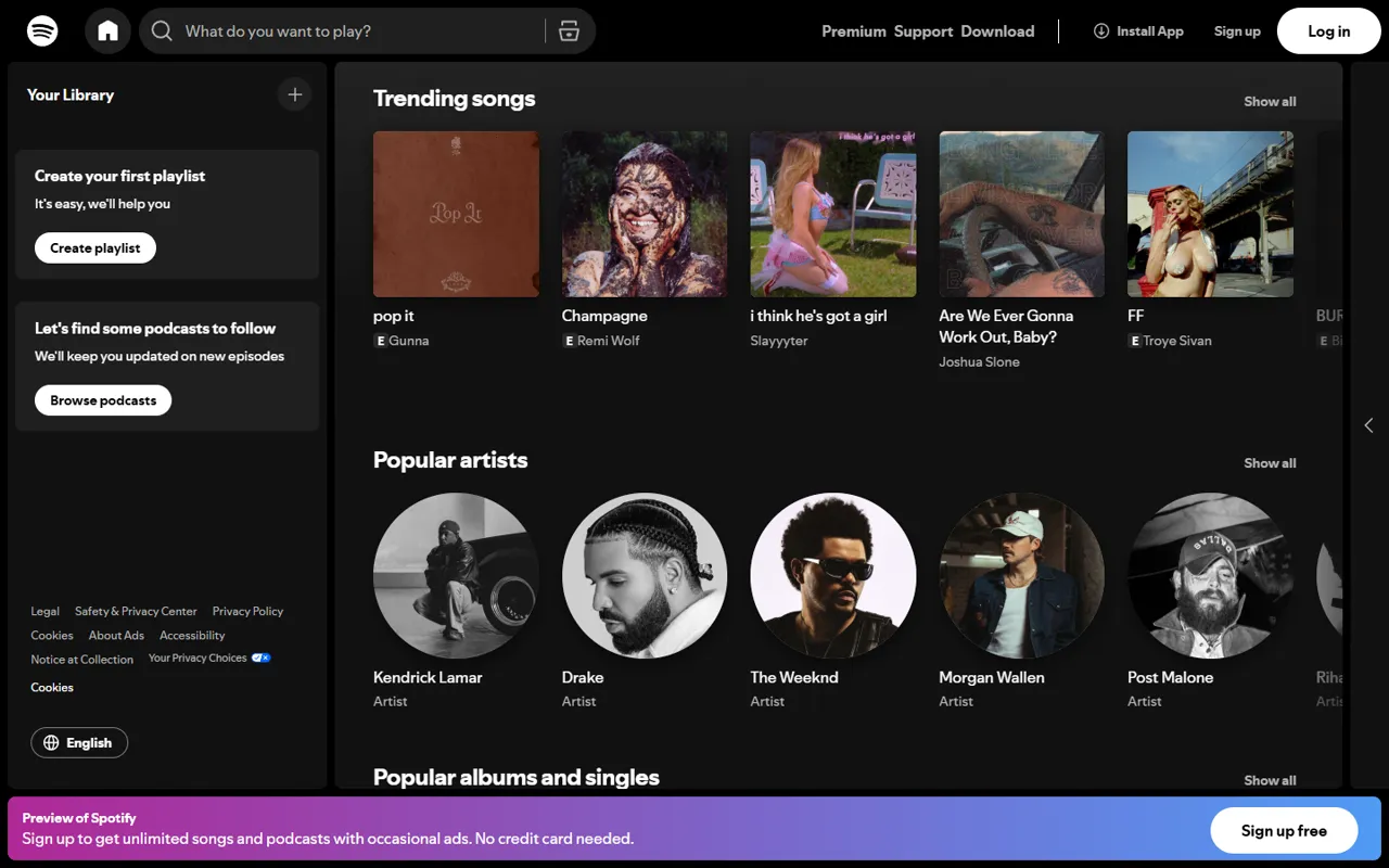
Spotify sets restrained SpotifyMixUI headlines in a heavy weight on a dark void canvas. Verdant (#1ed760) is reserved for actions, on fully rounded pill buttons, while the rest of the page stays with silver mist text and neutral surfaces. The most common corner radius is 9999px, with 6px and 50% on smaller elements.
spotify.com ↗Colors
Verdant
#1ed760
Primary actions and links
Ember
#9a6d4f
Secondary accent and highlights
Void
#121212
Page canvas
Silver Mist
#b3b3b3
Headlines and body copy
Deep Void
#000000
Surface or divider
Bone White
#ffffff
Surface or divider
Ash
#535353
Supporting colour
Graphite
#333333
Supporting colour
Deep Graphite
#1f1f1f
Supporting colour
Type scale
Buttons
Style reference measured from the public page at spotify.com on 2026-10-12 for design education. Spotify and its logos are trademarks of their owners; AnimatedWebs is not affiliated with or endorsed by them. Owners can ask us to update or remove this page via our copyright page.
# Spotify — Style Reference
> Spotify sets restrained SpotifyMixUI headlines in a heavy weight on a dark void canvas. Verdant (#1ed760) is reserved for actions, on fully rounded pill buttons, while the rest of the page stays with silver mist text and neutral surfaces. The most common corner radius is 9999px, with 6px and 50% on smaller elements.

**Theme:** dark · **Source:** https://www.spotify.com (captured 2026-10-12). Measurements come from the rendered page; roles are interpreted.

## Tokens — Colors

| Name | Value | Token | Role |
|------|-------|-------|------|
| Verdant | `#1ed760` | `--color-accent` | Primary actions and links |
| Ember | `#9a6d4f` | `--color-secondary` | Secondary accent and highlights |
| Void | `#121212` | `--color-canvas` | Page canvas |
| Silver Mist | `#b3b3b3` | `--color-ink` | Headlines and body copy |
| Deep Void | `#000000` | `--color-surface-1` | Surface or divider |
| Bone White | `#ffffff` | `--color-surface-2` | Surface or divider |
| Ash | `#535353` | `--color-surface-3` | Supporting colour |
| Graphite | `#333333` | `--color-surface-4` | Supporting colour |
| Deep Graphite | `#1f1f1f` | `--color-surface-5` | Supporting colour |

## Typography

| Role | Family | Size | Weight | Line height | Tracking |
|------|--------|------|--------|-------------|----------|
| Display | SpotifyMixUI | 16px | 700 | normal | 0 |
| Heading | SpotifyMixUITitle | 24px | 700 | normal | 0 |
| Body | SpotifyMixUI | 14px | 700 | normal | 0 |
| Nav | SpotifyMixUI | 14px | 700 | normal | 0 |

Font families on the page: SpotifyMixUI, SpotifyMixUITitle. Brand fonts are licensed by their owners; use a close open alternative (Inter, Geist, Manrope) if you don't hold a licence.

## Shape

- Corner radius, most to least used: 9999px, 6px, 50%, 4px, 8px
- Primary button: background `#1f1f1f`, text `#ffffff`, radius 50%, padding 12px, 16px / 400